I enjoyed every moment of creating this imagery for BOCA‘s new website and direct marketing needs.
Additionally, it was a pleasure to work alongside BOCA’S supremely talented Director of Marketing, Sebastien Hue.
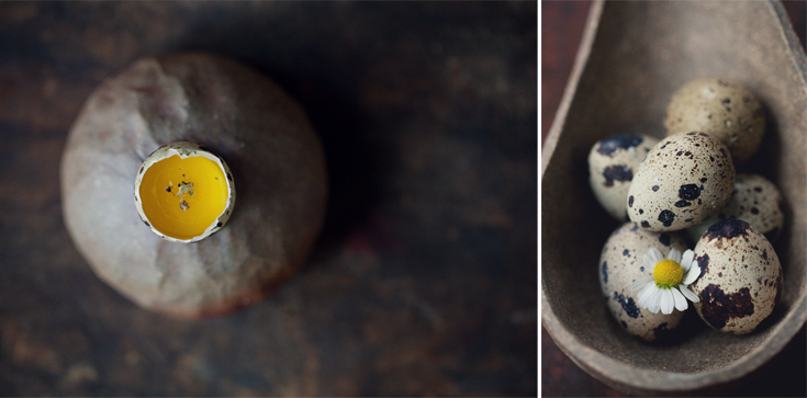 I’ve shared my thoughts on this subject before, but I believe it’s worth mentioning again and again as professional photography is an investment and should be used to it’s fullest capacity. Once you have your final imagery, what you do with it and how you present it makes the difference between so-so and captivating. Rather than line one image up after another on a website, or, place them randomly here and there, think about presenting your story, your restaurant, your wares, your food – in an inviting and artful manner. Don’t stop short. It’s the perfect opportunity to add incredible visual impact. And, let’s face it, it’s the visual impact that gets your attention before anything else. Captivating imagery married with a beautiful logo and tasteful design, tell of the personality of place, people, and food as well as translates into powerful visual/printed marketing opportunities.
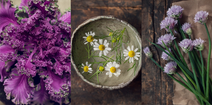
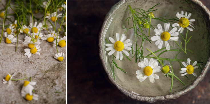
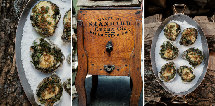
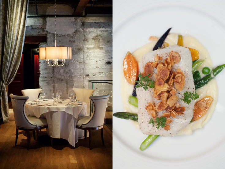
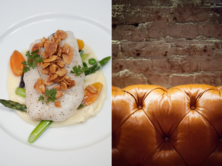
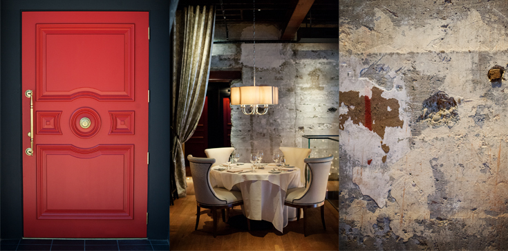
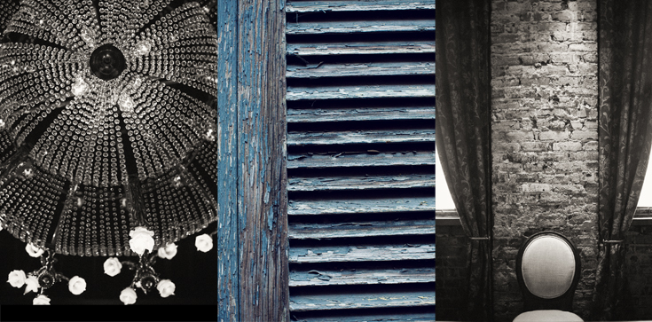
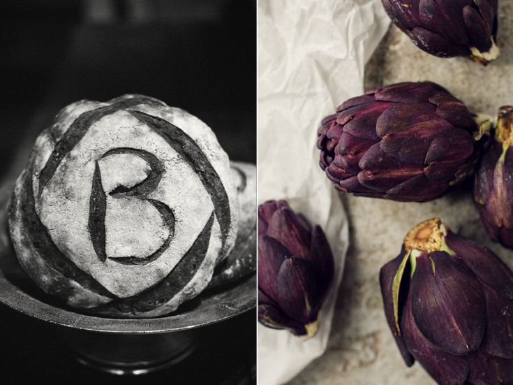
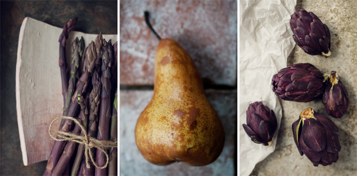
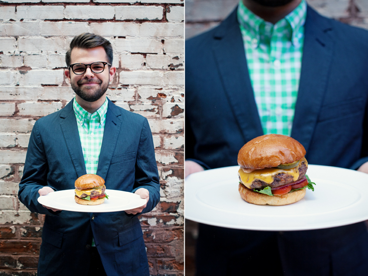
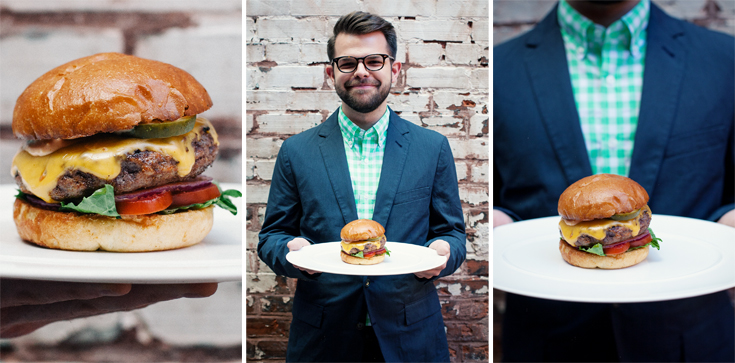
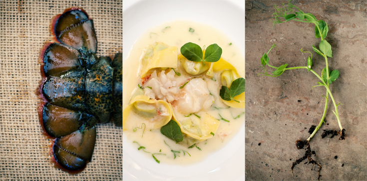
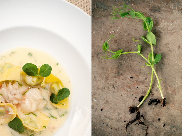
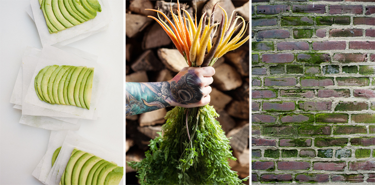
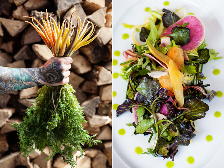
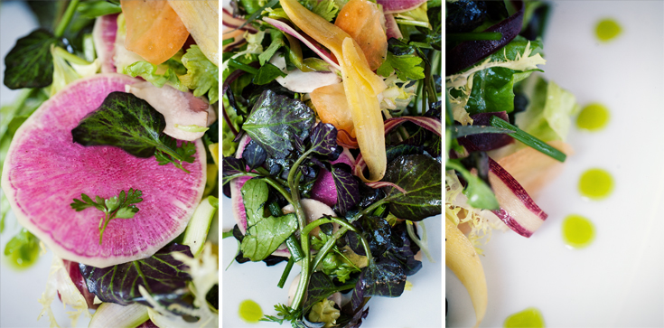
Sebastien and I sat down together and went through multiple variations of parings. The combinations were almost endless. Here are some pairings, with variations. 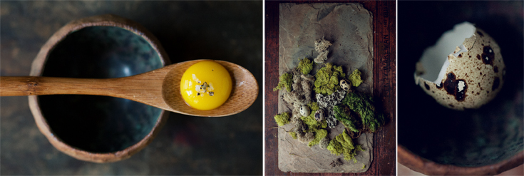





4 Comments
beautiful!
Thank you so much Anne!
Love the interior finishes juxtaposed w food. Texture, color, proportion – so many parallels – and opposites that attract.
A fresh perspective on the restaurant that I had not seen from this way before. Refreshing! Exciting! Beautiful! Cheers!
Thank you Michelle for such a lovely compliment! There truly was so much beautiful eye candy all around.