Welcome to the start of the new year and the continuation of prompts and challenges that are made to help YOU practice your way to BEAUTIFUL FOOD PHOTOGRAPHS!
I want to thank all of you for your full hearted participation and personal passion you bring to this community while learning, sharing, giving and having fun together.
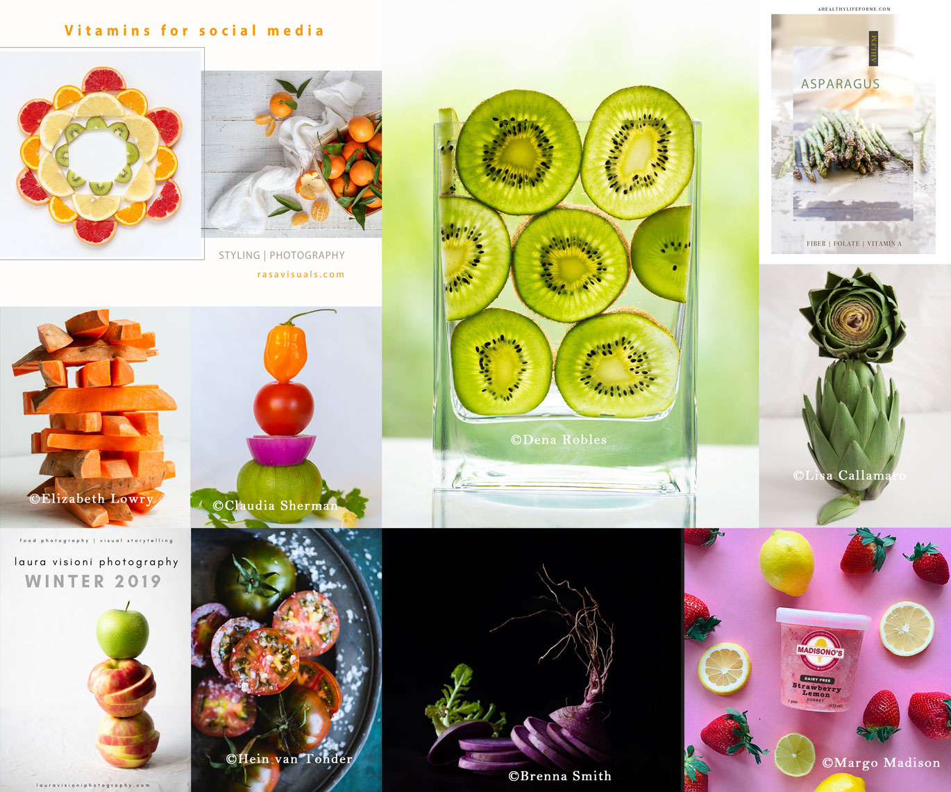
As we just finished up our first prompt of the year – Cut Up + Stacked – I put together a quick collage of your images.
How fun and colorful and creative are these!
Grey Salt Collective – Practice Your Way to Beautiful Food Photogaphs
If you’re visiting for the first time and are not sure what this Grey Salt Collective thing is all about, just head over HERE to get all the info.
Basically, it’s free, it’s fun, and it’s easy to join.
If you’re a beginner to intermediate food photographer interested in bettering your skills, GSC offers targeted themes and prompts to make the practicing so easy and inspiring – with a community of like minded creatives!
The community lives within a facebook group where we openly share all things food photography, like gear questions, lighting, propping, styling, bts, and much more.
You can also find us on instagram under the hashtag #greysaltcollective.
I also use this blog to share behind the scenes shots, technical notes, and tips sprinkled throughout these posts – after all, this is a food photography blog.
Like These BTS Below:
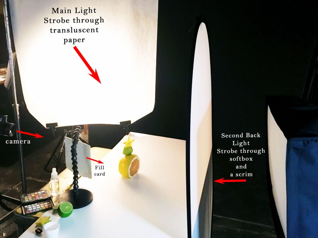
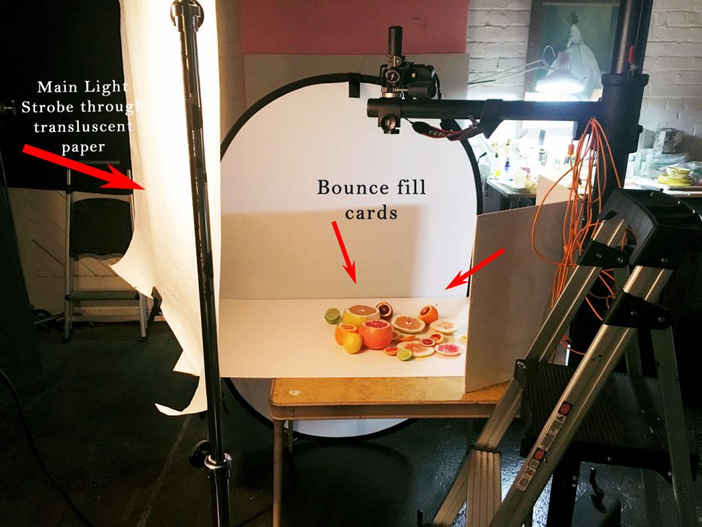
Above and below are bts shots of how I lit the 2 images in the first diptych below.
In the first bts, I am using two lights, my main light (a strobe) is to camera left lighting my subject, and a second light (another strobe in a softbox) is illuminating the back of my shot.
In the second bts, though the large reflector disc is set up in the back of the set below, as it is in the above bts shot above, the strobe light behind it is not on.
In this shot, the disc is only being used as an additional fill.
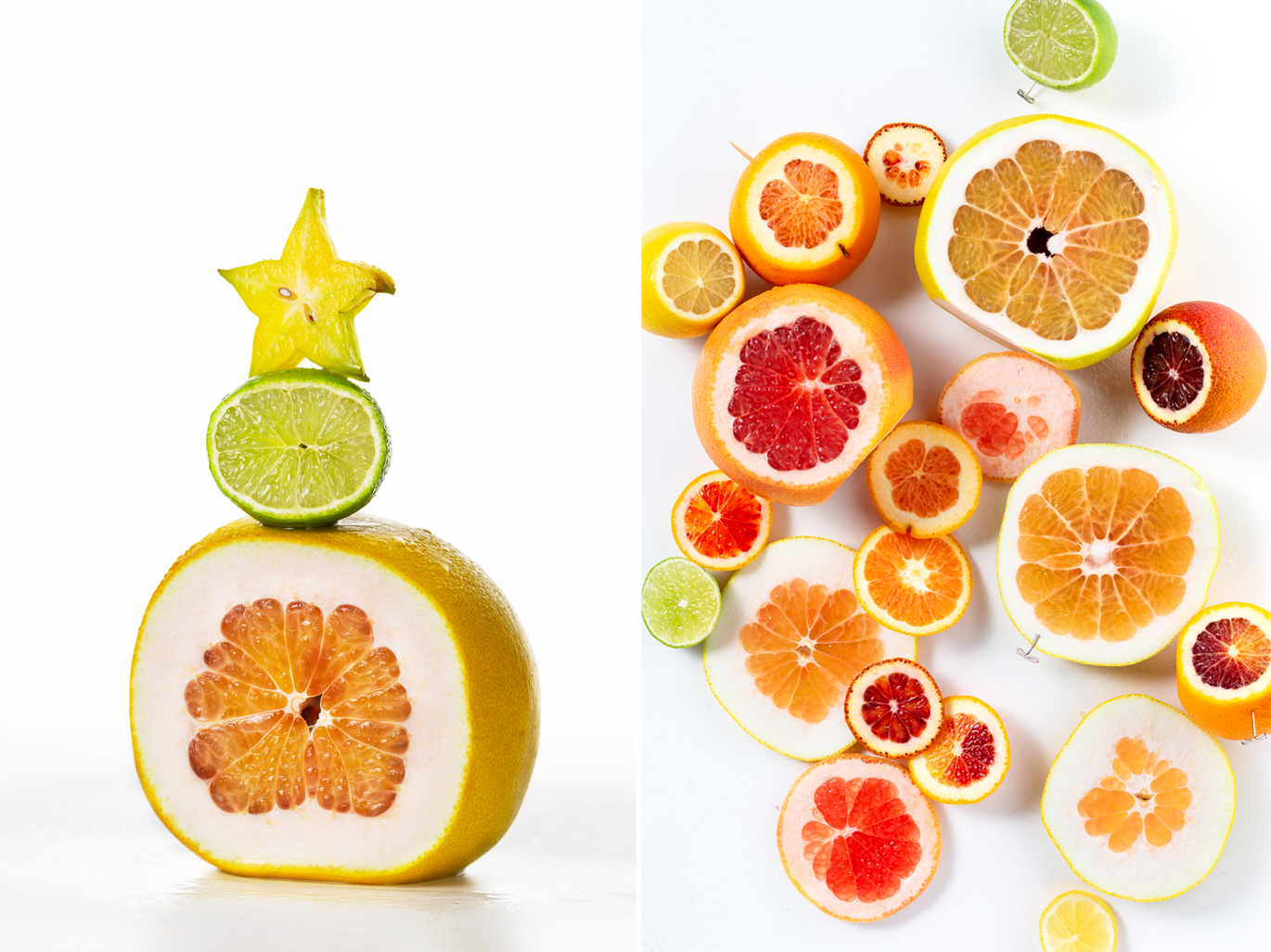
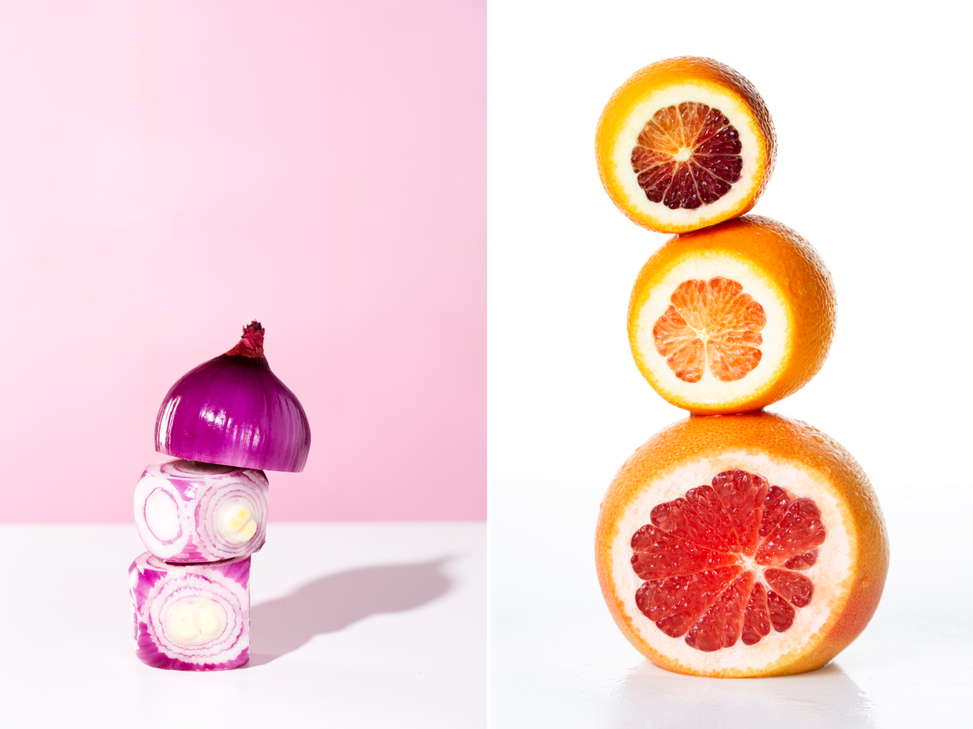
Below are a couple more images I created from this super fun prompt, with essentially the same lighting set ups from the images above.
The biggest difference is that I added a pink background, and then pointed my second (back) light at it at an angle, allowing that light to naturally feather off the further away it went along the background, giving the background a slight gradient look.
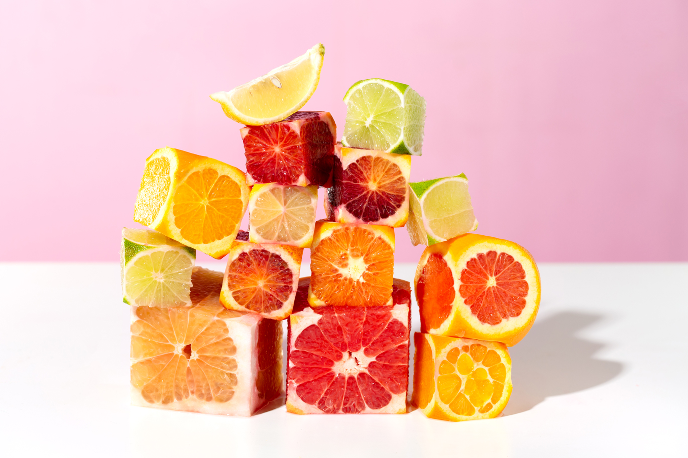
There is less of a gradient on the stacked red onion shot below because the frame itself is much more narrow and I am closer to where the back-light is brightest.
